
The grey era is over. For the better part of a decade the formula barely changed. White walls. Grey everything. Black accents. Clean, minimal — and eventually, everywhere. Now it’s official. The paint industry’s own 2026 forecasts say so: Benjamin Moore and Sherwin-Williams both named warm, earth-toned Colours of the Year. Neither one is a cool grey.
So what does that mean for your walls? In 2026, colour is about warmth. Personality, too. Not stark minimalism. Below: the palettes worth considering, the rooms they suit, and — this matters more than most colour guides admit — how they behave in Fraser Valley light.
1. Warm Neutrals Take Centre Stage
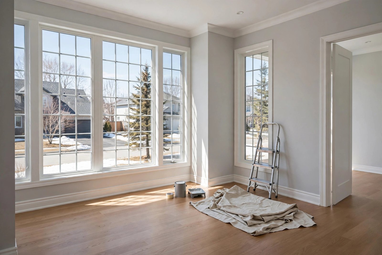
The headline colour story of 2026 is the warm neutral. Start with the two big announcements. Sherwin-Williams named Universal Khaki (SW 6150) its 2026 Colour of the Year. A midtone tan. Earthy depth to it. The kind of colour that grounds a big living room without shouting. Benjamin Moore went the other way. Darker. Its pick, Silhouette (AF-655), is a rich espresso shot through with charcoal undertones. Dramatic, yes. But still warm.
Then there’s the supporting cast. That’s what you’ll actually paint on most walls. Warm whites. Creamy off-whites. Soft beiges. Greiges that lean warm, not cool. Benjamin Moore’s White Dove sits in this territory. So does Sherwin-Williams’ Accessible Beige. Colours with enough body to look chosen. Deliberate. Not like you ran out of ideas.
Where it works: open-concept living areas and hallways, mostly. Anywhere, really, where you want a calm backdrop and the furniture and wood tones do the talking. Selling soon? If you’re repainting to sell, warm neutrals are the safest bet there is in 2026. Broad appeal. Nobody gets scared off.
2. Sage and Olive Greens: The Accent Colour of the Year
Warm neutrals are the base. Green is the accent. And not just any green. The NKBA’s 2026 trend data has sage green named by 64% of design experts and olive by 43%. Earthy, brown-based greens, both of them. The bold teals and emeralds? Far less attention this year.
Why does sage work? It behaves like a neutral. A neutral with a pulse. Warm whites don’t fight it. Neither do natural wood, brass fixtures, or stone. In kitchens it’s turning up on islands and lower cabinets. Bedrooms and home offices are getting it as a full-wall colour. And it stays restful.
Where it works: bedroom accent walls, kitchen islands, powder rooms, front doors. In small rooms, use it on one wall or on cabinetry rather than everywhere. All four walls is too much. Full-room sage in a north-facing Fraser Valley bedroom, in January, feels heavy fast.
3. Clay, Terracotta, and Earthy Tones
Go one step warmer than sage and you land in the clay family. Terracotta. Warm clay. Muted rust. Sunbaked ochre. These are the colours of 2026’s most confident rooms — dining rooms, reading nooks, and feature walls that want actual personality.
Earthy tones come down to one thing. Commitment level. Get it right and a terracotta dining room — warm white trim, wood furniture — feels collected. Timeless. Get it wrong and the same colour, in a small windowless bathroom, feels like the inside of a pottery kiln. So sample generously. Paint a big test board. Move it around the room. Check it morning, afternoon, evening. Then buy the gallons.
Where it works: dining rooms and accent walls. Exteriors too, on craftsman-style homes. Pair clay with creamy trim. Never stark white. Bright white trim against these tones reads harsh, every time.
4. The Dark, Moody Accent (Used Sparingly)
Benjamin Moore’s Silhouette points the other way entirely. Deep, near-black browns. Charcoals. Deliberate drama. The boldest version of it is colour-drenching. Walls, trim, ceiling — all one deep tone. Sounds like a lot. In a room with good natural light, though, and white or light furniture for contrast, it works surprisingly well.
For most Abbotsford homes, though, the practical version is smaller. A Silhouette-type espresso on built-in shelving. A home office. A powder room. Here’s the odd part: dark colours recede visually. So a dark powder room often feels larger, not smaller. The corners just disappear.
Where it works: powder rooms and home offices. Built-ins. The bedroom wall behind the bed. Low-light hallways? Skip it. Unless you want a cave.
5. What About White? It Is Not Gone
Reports of white’s death are exaggerated. Crisp white trim hasn’t gone anywhere. Neither have white ceilings or white cabinetry. They’re still the backbone of most 2026 palettes. What changed is the walls. They moved warmer. So the winning formula this year is warm white walls + white trim in the same family. Not the old contrast. No more grey walls against white trim.
Love white walls? Then shift warm. Look for whites with creamy undertones. Slightly yellow ones. Skip the blue-grey undertones. Here’s why. In Fraser Valley grey winter light, a cool white can read dingy. A warm white stays luminous. And trim colour matters here just as much as wall colour. Paint the trim the same warm white as the walls, just in semi-gloss, and you get a seamless, modern look. Go with a brighter white trim instead and the contrast turns crisper. More traditional.
6. Choosing Colours for Fraser Valley Light
Most colour guides skip this section. Don’t. It matters here more than almost anywhere. Abbotsford gets months of overcast skies. Months. And light changes colour. A north-facing room gets cool, indirect light, and that light drains warmth right out of a paint colour. South-facing rooms are the opposite. Warm direct sun, and it intensifies everything.
Practical rules for local light:
- North-facing rooms: go one step warmer than your instinct. That sage you love will read cooler and greyer than the chip suggests.
- South-facing rooms: colours intensify — a terracotta that looks perfect on the chip can go loud in full afternoon sun. Consider muting it a step.
- Small, dark rooms: light, warm colours bounce what light exists. Save the moody espresso for rooms with a window.
- Test properly: paint sample boards (not the wall), view them at different times of day, and live with them for at least 48 hours. The $30 in sample pots is the cheapest insurance in the whole project.
7. Finish Guide: Matte, Eggshell, Satin — Where Each Belongs
Colour gets all the attention. Finish decides how the paint actually lives. And the wrong sheen in the wrong room? One of the most common DIY regrets there is.
| Finish | Sheen level | Best rooms | Notes |
|---|---|---|---|
| Flat / Matte | None | Ceilings, low-traffic bedrooms, formal dining | Hides wall imperfections; marks easily, hard to clean |
| Eggshell | Soft glow | Living rooms, bedrooms, hallways | The all-rounder; subtle warmth suits 2026 palettes |
| Satin | Medium shine | Kitchens, bathrooms, laundry, kids’ rooms | Washable and moisture-resistant; shows flaws more |
| Semi-gloss | Noticeable shine | Trim, doors, cabinets, window frames | Durable and wipeable; highlights every imperfection |
The 2026 note: matte and eggshell dominate the trend palettes because flat finishes make warm colours look richer. But be honest about your household — matte walls and toddlers are a short-lived combination. Satin in the kitchen and bathrooms is non-negotiable with Fraser Valley humidity.
8. Exterior Colours: The Same Warm Shift
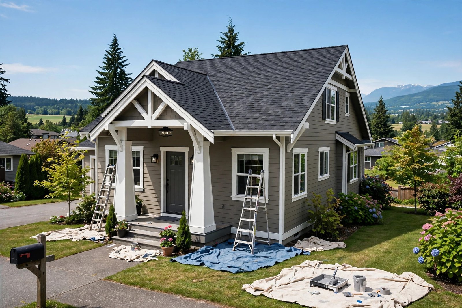
The warm turn is not just indoors. Exterior palettes in 2026 are shifting too. Away from the grey siding and white trim that dominated new builds. Toward warmer taupes. Clay tones. Deep earthy accents on front doors and shutters. Abbotsford is full of craftsman and rancher-style homes, and on those, this palette just works. Warm taupe body. Creamy trim. A sage door, or a deep red one. Current, without chasing novelty.
One caution specific to our climate: dark exteriors show the green. In the Fraser Valley’s damp winters, algae and mildew tint north-facing siding within a couple of years — darker colours show it more. Going dark outside? Then budget for a wash every year or two. And buy a quality exterior paint, one with mildew resistance built in.
Frequently Asked Questions
What is the most popular paint colour for 2026?
Warm neutrals lead, with sage green as the top accent. The Colour of the Year picks tell the story. Sherwin-Williams went with Universal Khaki, a warm midtone tan. Benjamin Moore picked Silhouette, a rich espresso-charcoal. And among working designers? Light neutrals dominate the walls. Sage (64%) and olive (43%) lead the accents. That’s per NKBA 2026 data.
Which paint colours make a small room look bigger?
Light, warm colours with an eggshell or satin finish. Warm whites reflect the most light. Pale beiges do too. A touch of sheen helps — it bounces light around the room. Keep the ceiling white, or a lighter tint of the wall colour. Now, dark colours can work in a small powder room. The corners visually disappear. But in a small bedroom or living room? Light and warm wins.
Should I follow colour trends if I plan to sell soon?
Lean warm-neutral, not bold. Resale within a couple of years? Then paint the main living areas warm white or soft beige. Broad appeal. Photographs well. And buyers can picture their own furniture in the room. Save the terracotta dining room and espresso office for your forever home. Our painting cost guide breaks down what a full-house repaint runs as a 2026 planning range.
How do I test paint colours properly?
Large sample boards, 48 hours, all light conditions. Two coats, on a large white board. Not directly on the wall. Old colours distort the test. Then move the board around the room. Morning light. Midday. Evening. Lamps on, too. And in an Abbotsford winter, check it on a genuinely grey, overcast day. That’s the light you’ll live with most.
Matte vs eggshell — which should I choose for living rooms?
Eggshell for most living rooms. Matte looks richer, no question. It hides wall flaws, too, which suits 2026’s warm palettes. But it scuffs. It doesn’t wash well either. Eggshell gives you nearly the same soft look — with far better durability. Save true matte for ceilings. And for very low-traffic formal spaces.
How much does it cost to repaint a room in Abbotsford?
As a 2026 planning range, figure roughly $400–$900 per average room. That’s professional painting, walls only, two coats. A full house interior runs $3,000–$8,000, depending on size and condition. Changing from dark to light costs more. Deep reds and espressos often need three coats. Or a tinted primer. See the full breakdown in our interior painting cost guide.
Ready to Put Colour on the Walls?
The 2026 palette rewards warmth. And a bit of confidence. Creamy neutrals as the base. Sage and clay for the personality. Deep espresso where you want the drama. Test in your actual light. Choose finishes for how you actually live. And don’t skip the sample pots.
If you would rather have it done right the first time — proper prep, crisp lines, and no roller marks — take a look at our interior painting services. And if colour is part of a bigger refresh, our 2026 kitchen design trends show how these palettes play out across the whole home.
Colour names reference Benjamin Moore and Sherwin-Williams 2026 collections; always test samples in your own light before committing.
One Response